
Philosophy: use it exactly how you want#
The manifesto line that drives this page is short: everything should be customizable. Theming is where that promise is easiest to keep and easiest to see. Nodal lets you pick the colors, the fonts and the layout, with more options planned, because the goal is that nobody has to settle for someone else’s idea of a workspace. Anything the settings cannot express is the job of plugins.
Theming also has a history. The earlier ToolTab v1 app shipped a header theme selector that switched an entire resource palette between Green, Light, Purple, Gold, Blue, Dark, Red and Black/red. Nodal imported that library as its accent palette and then went further, because a single selector for everything leaves no room for the person who wants a light base with a dark terminal or a quiet gold accent.
What you can change#
Base color#
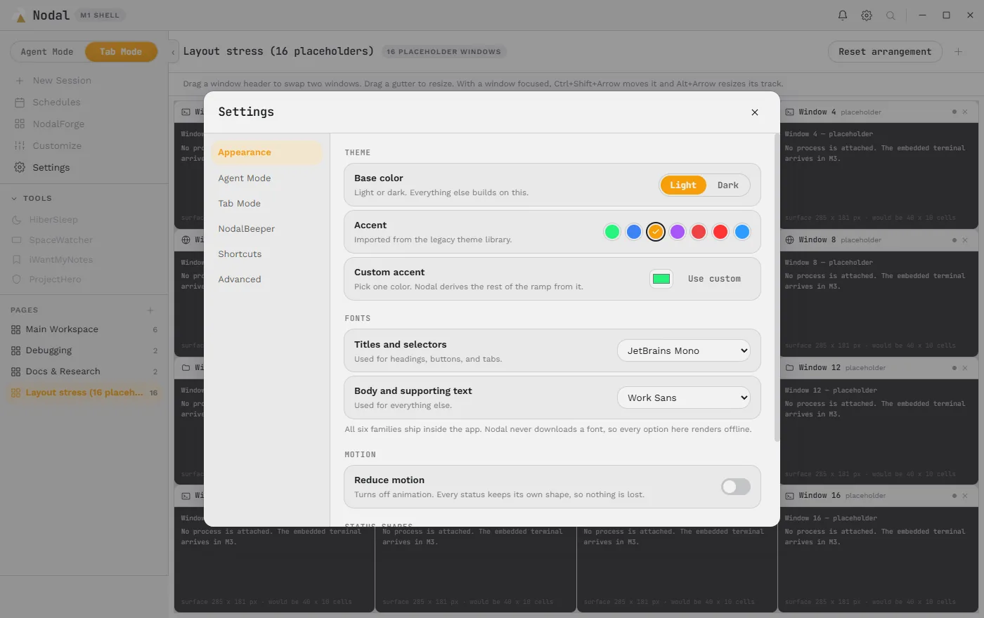
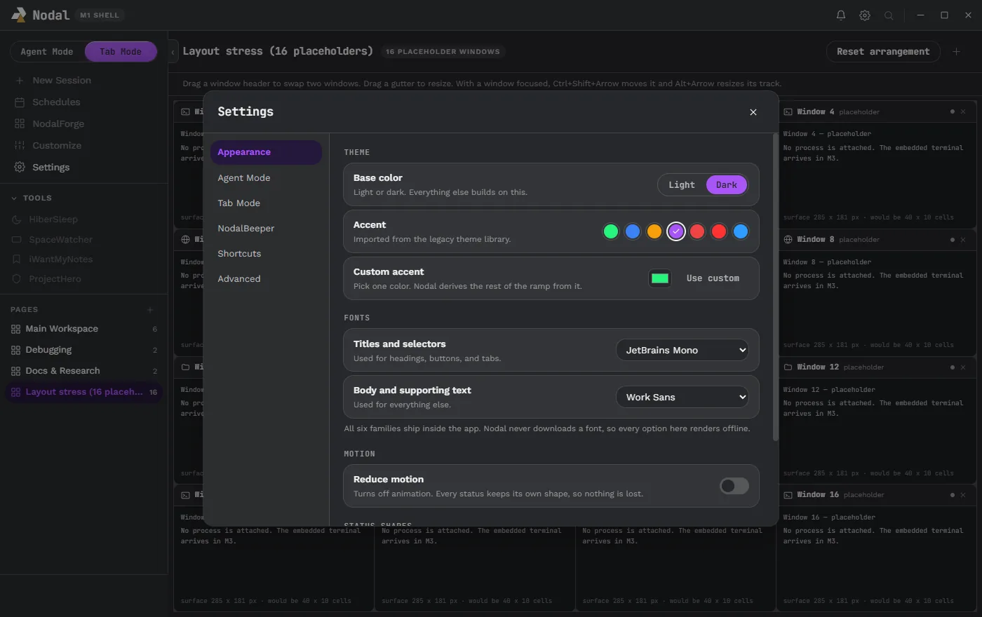
Light or dark. Everything else builds on this choice, and it is the one place you pick a surface. Both are real designs rather than an inversion of each other, with their own surfaces, borders and contrast values.
Accent#
Pick one of seven accent swatches (green, blue, gold, purple, two reds and a sky blue in the early palette) or choose a custom accent with a color picker. You choose only one color: Nodal derives the rest of the ramp from it, so selected rows, primary buttons, focus rings and links all stay coherent without you assigning twenty values by hand.
Fonts#
Fonts have two roles. Titles and selectors is used for headings, buttons and tabs and defaults to JetBrains Mono. Body and supporting text is used for everything else and defaults to Work Sans. Each role has its own picker among six families that ship inside the app, which include JetBrains Mono, IBM Plex Mono, Work Sans and Manrope. The settings page states the rule: Nodal never downloads a font, so every option renders offline.
Motion and status shapes#
A reduce-motion switch turns animation off. The page says why it is safe to do so: every status keeps its own shape, so nothing is lost when motion goes away. That one sentence reflects a rule applied everywhere in the interface, that a state must never be communicated by color or movement alone. Every status dot state has a text equivalent on hover or focus.
Layout#
Windows can be dragged to swap or move, gutters dragged to resize, and a Reset arrangement button returns a page to its defaults. The right sidebar remembers the width you drag it to and offers a Full View for any tab. The Tab Mode page describes the controls.
Sharing a whole theme#
A complete custom theme can be transferred between machines as a strict theme file. The transfer is deliberately complete and strict, so a theme arrives whole rather than half-applied. Independent semantic colors let success, warning and error keep their meaning even when you pick an unusual accent. The planned community features go further: share your themes, layouts and plugins with everyone, and submit a favorite for approval so it can ship in the app by default. Nothing is shared or submitted unless you decide.
Design thinking behind the defaults#
The default look is not an accident. Before the visual build, an audit compared four directions on the same agent shell and measured contrast for the recommended one. The study rates a graphite and muted blue direction as the recommended default for a dark-first shell: a calm graphite ground with a desaturated blue that carries navigation and focus without becoming a neon signal, with accent reserved for selection, primary actions and keyboard focus so that success, attention and risk colors remain free to mean exactly what they say.
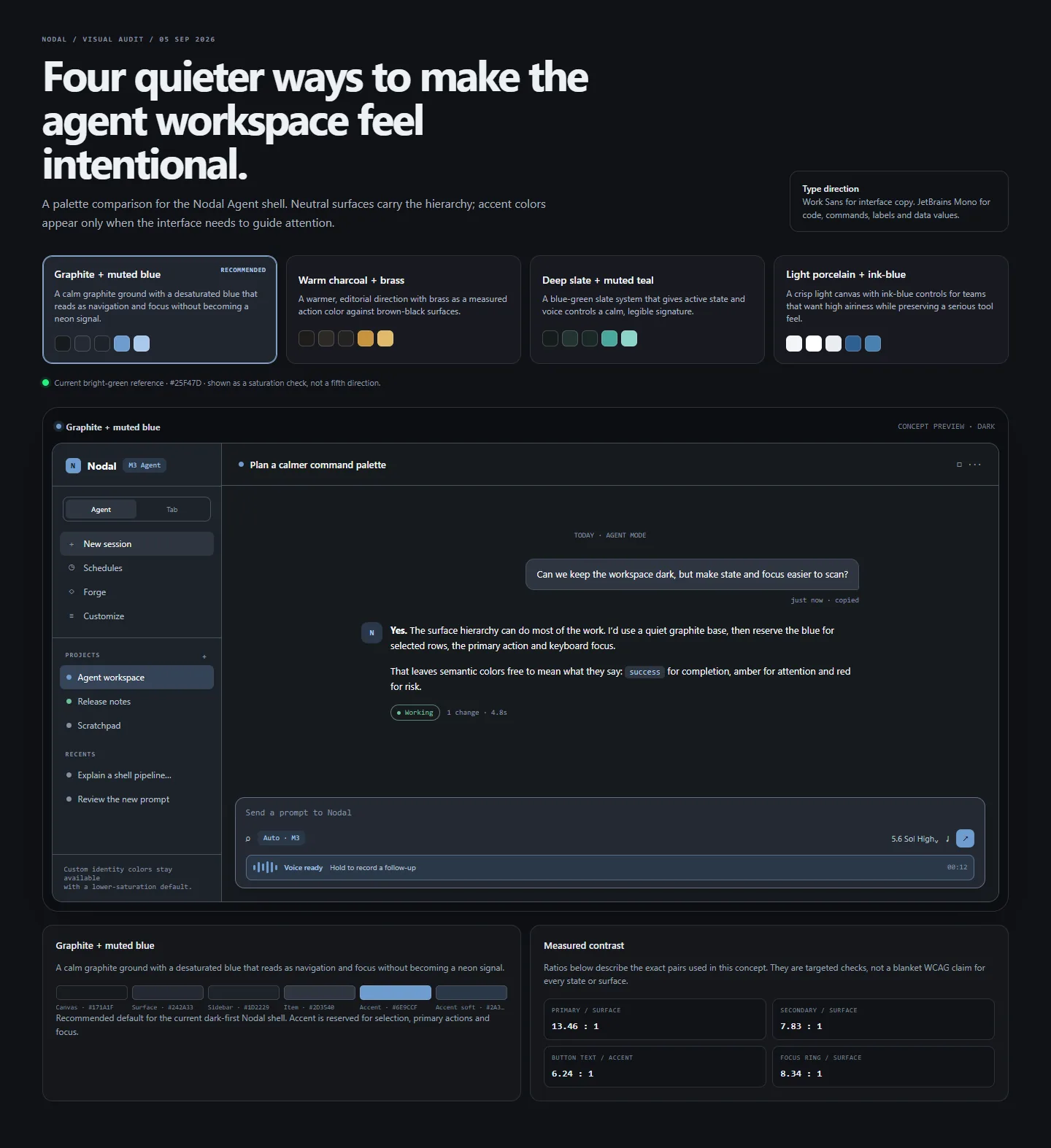
The measured pairs in that study are specific: primary text to surface 13.46 to 1, secondary text to surface 7.83 to 1, button text to accent 6.24 to 1 and focus ring to surface 8.34 to 1. A later six-theme contrast audit checked the title and status motion in all shipped themes. The type direction is Work Sans for interface copy and JetBrains Mono for code, commands, labels and data values, which is also what this website uses so that it feels like the app.
What makes a good theme system#
The project’s rules on theming are worth quoting in spirit. Use tokens, never raw values. Derive ramps from one accent instead of asking for many. Keep every state legible without color. Respect reduced motion. Do not download fonts at runtime. Make the whole thing exportable. Those rules are visible even on this site: the light and dark modes and the accent here are built from a small set of tokens, and the toggle at the top of the page remembers your choice locally and falls back to your system preference.
What is next#
- User-chosen status icon shapes and colors per item, with small motion to reinforce state, leading to the avatars described on the AgentBoard page.
- More customization options of every kind, as the owner finds things worth bending.
- A shared theme library and a theme marketplace, later scope with an explicit trust story.
See the roadmap for the full list, and the features overview for how theming connects to everything else.